
Book Design
HANSEL AND GRETHEL
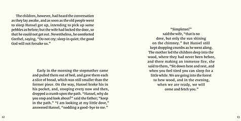
This project is designed with the concept of encouraging young children to engage in creative play while listening to the story. The design includes spacious body copy with large fonts to help children familiarize themselves with the alphabet. To avoid monotony in the narrative, variations in size and shape are introduced throughout the text, making the learning experience both fun and interactive. The overall aesthetic emphasizes free expression, allowing children to enjoy coloring and adding their own ideas as they explore the story.

Front page


Back page


HANSEL AND GRETHEL-with Illustration


Magazine Spread Design
Inspired by Twen
This magazine project explores contemporary editorial design through the visual language established by Willy Fleckhaus for Twen magazine. Drawing from the publication’s distinctive typographic discipline and clarity, the spreads were developed with a subtle reference to 1960s aesthetics rather than direct reproduction. Schmalfette CP and Times New Roman are used to create contrast and structure, allowing typography to lead the composition. The design focuses on proportion, rhythm, and restraint, reinterpreting Twen’s timeless approach within a modern editorial context.

Bodycopy Example


Mockups


